The Home dashboard is your central command center in Microscope.ai, providing an at-a-glance view of your project's AI presence performance. This guide explains how to navigate and interpret the Home dashboard effectively.
Accessing the Home Dashboard
- Log in to Microscope.ai
- Select your project (if you have multiple)
- You'll land on the Home dashboard
- Or click Home in the left sidebar anytime
Dashboard Overview
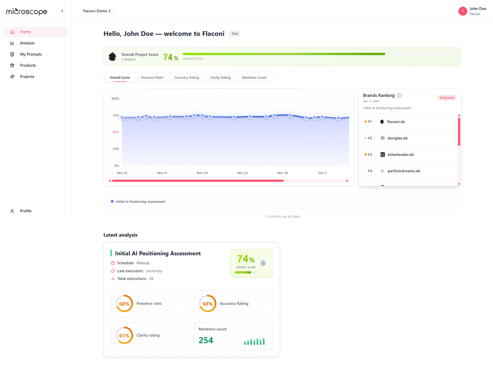
The Home dashboard aggregates data from your most recent analysis execution, showing:
- Overall project performance
- Key metrics at a glance
- Trend indicators
- Category breakdown
- Recent activity
- Quick action buttons
The Home dashboard shows data from the active project. Switch projects to see different data.
What It Shows
- Your current overall score
- Trend indicator (up, down, or stable)
- Percentage change from previous execution
- Date of last analysis
Quick Interpretation
- Green - Performance improving
- Red - Performance declining
- Orange - Stable performance
- Click for detailed analysis results
Key Dashboard Sections
1. Performance Charts
The charts section displays the project’s performance evolution over time, including the following components:
Overall Score
- Composite score summarizing overall AI presence performance
- Calculated from multiple underlying metrics
- Used as a high-level performance indicator
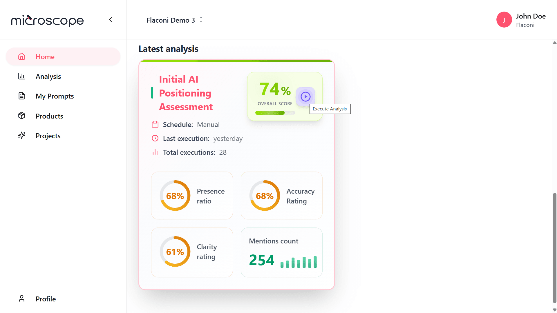
Presence Ratio
- Measures how often your brand appears across the analyzed prompts
- Displayed as a percentage
- Trend indicator shows change over time
- Key indicator of AI visibility
Accuracy Rating
- Measures how accurate the AI-generated mentions are
- Displayed as a rating score
- Trend indicator shows change over time
- Critical indicator of content quality
Clarity Rating
- Measures how clear and unambiguous the AI-generated mentions are
- Displayed as a rating score
- Trend indicator shows change over time
- Indicator of message clarity and consistency
Mention Count
- Total number of times your brand is mentioned across the analyzed prompts
- Displayed as a numeric value
- Trend indicator shows change over time
- Quick check on overall visibility
2. Brands Ranking
The Brands Ranking compares the project’s performance against other brands included in the same analysis to help understand its competitive position within the market, and includes the following components:
- Ordered list of brands based on positioning.
- Numerical ranking (#1, #2, #3, etc.).
- Brand identity (name and domain).
- Ranking date and analysis type.
- Total number of brands evaluated.
3. Latest analysis
The Latest Analysis section summarizes the most recent analysis executed for the project to provide a quick and detailed snapshot of its current status, allows quick access to the analysis details by clicking on any element (redirecting to the analysis panel), and also enables users to run a new analysis directly from this section via a dedicated button.
Quick Actions
Convenient buttons for common tasks:
Run Analysis
- Execute your project's analysis immediately
- Quick way to get fresh data
- Check execution quota before running
View Latest Results
- Jump to most recent analysis results
- Shortcut to detailed view
- See full dashboard and table
Create Analysis
- Start new analysis configuration
- Useful for testing variations
- Configure different prompt sets
Manage Prompts
- Quick access to prompts library
- Add custom prompts
- Review and edit prompts
Dashboard Alerts and Warnings
Red Flags to Watch
- Sudden score drops - Investigate immediately
- Declining accuracy - Content issues
- Falling mention rates - Visibility problems
- Negative sentiment increase - Reputation concerns
- Large model discrepancies - Inconsistent presence
Warning Indicators
Dashboard may show warnings for:
- Execution failures
- Quota approaching limit
- Outdated data (analysis not run recently)
- Configuration issues
- Missing critical information
Multi-Project Dashboards
Switching Projects
- Use project selector/dropdown
- Dashboard updates to show selected project
- Each project has independent data
- Bookmarks for quick switching
Next Steps
Now that you understand the Home dashboard, you're ready to:
- Explore project-level analysis features
- Learn about detailed analysis results
- Set up recurring analyses
- Optimize your AI presence